Showing posts with label design. Show all posts

Friday, 7 August 2015

Design Assessment Task

For this assessment task we had to complete a flyer and postcard. Designing the layout of the flyer was quite a challenge!


 I'm pleased with the outcome of the Postcard, the texture over the text was to lift of the white background a little more and give an "earthy" feel.


Tuesday, 16 June 2015

LA 10 Branding

For this exercise we had to come up with a logo, t-shirt, shop sign and business card for a fruit store.

These were my picks of the designs.


 My first choice of shop sign was to be edited onto a real sign. However, upon reviewing the design and feedback from the teacher, I would use the last image or modify the first if it was the final product.

Monday, 15 June 2015

LA 09 Type Families

For this exercise we looked at typefaces and how they can be used. As well as matching up typefaces to shoes we were also asked to match up types to cars.


As well as piecing together and formatting text and creating an anatomy of type poster, we were also required to hand draw fonts/typefaces.


LA08 Thumbnailing

For this exercise we had to find 50 ways to represent/interpret a banana by drawing thumbnails. Out of those designs we then selected the one that we felt worked best.


LA07 Grids

For this exercise we looked at grids in the environment around us and printed media. 


 The above image is an example of a grid.


This image could be consider a non-grid, but potentionally also as following a grid, although less structured.


These images were the examples from print media, including hand drawn guides and ruler examples from software.

LA06 Design Elements

For this part of the learning activities we had to explore various elements and produce a booklet explaining the design elements and principles using example from printed media. As well as this we looked at how the elements are used to bring an image together.


We drew a still life looking through a rectangle frame, this created a condensed space and had objects running out of view.


Texture was also something we explored, this was done by creating a gradient in photoshop and adding a texture filter. I have used a canvas texture on the image below.


Friday, 22 May 2015

LA05 Colour

Colour Associations and Words

For this activity we had to match up words that we associate with colours and also select different shades that pair best with each word.


Colour Wheel

Here we had to make our own colour wheel based on the instructions provided.


And then using left over squares we constructed our own colour wheel in our journals and thought up some colour schemes.


Colour College

Using our new knowledge we then had to creat a colour college with numbers.


Colour Associations: Australia

Next, we noted what colours we associated with Australia and made a "mood board" to reflect this, as well as a personal one for our own lifestyle.


Colour Branding

Our next task was to explore colour branding and how it is used. An interesting trend I noticed was contrasting colours and colours that reflect the brand concepts or marketing point.


Illustration Briefs: effective limited use of colour

In this, we looked at how book covers often rely on limited colours to present their message and the different methods illustrators and designers use to put this across. Here are some examples I found.


Colour Research

The final task was colour research which can be found at the link here!

Sunday, 3 May 2015

LA 04 - Postive/Negative and Whitespace


Postive/Negative Space


Whitespace


1. Print advertising
The whitespace has been used here to make the imagery central and doesn’t remove focus from the way the subject matter flows around in continuous circle.


 2. Street Advertising
This billboard uses whitespace to create the image and outline of the Nike tick. It also creates contrast with the composition of the subject matter to draw our focus in.


3. Website 
The Apple website utilises whitespace to create a clean, simplistic page to navigate. This method also makes their products the first focus and noticeable element of the page.


 4. Art Gallery
Whitespace is often seen in “white cube” art galleries. Its purpose is to create open and versatile spaces, as well as not detracting the gaze from the art work hung or displayed there.


Saturday, 2 May 2015

LA 03 - Black Squares


Learning Activity 03 – Black Squares 

Part A


 Part B


1. Ordered
This advertisement is an example of “ordered” placing. The nail polish is neatly placed and aligned as is the text and the background imagery. The lighter strip in the centre highlights the alignment.


2. Increase
The text in this advertisement is an example of increase. The font gradually expands and moves forward. Interesting to also note the text follows the perspective from the horizon, giving greater depth.     


3. Bold
The use of dark and bold lines from the eye pencils is important here. As the advertisement is aiming to show the “bold” in the product, the imagery has been set to reflect this. As the background and bodies of the pencils are so dark, the focus on colour is more vivid.


4. Congested
The congestion in this image can be seen in the close proximity of the line of lettering, with the “&” character overlapping with the “H”.


5. Tension
Tension in this image can be seen through the contrast of the soft rounded form of the brand name and the fluid motion of the paint in comparison to the bold and sharp edges of the slogan.
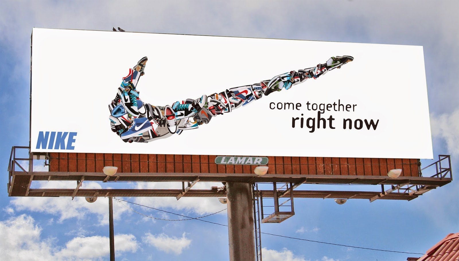


6. Playful
The bright, bold colours make this image “playful” as does the breaking up of the message. The use of shadow in the circles also gives a sense of depth.


LA2 Filing

Below is the invitation we had to partially create and piece together from given files. This was an introduction to using InDesign.